|
|
Post by Inaaca on Jun 18, 2009 19:21:52 GMT -8
A thread for all of my more polished pieces of grayscale inking and linework.
Enjoy!
|
|
|
|
Post by Inaaca on Jun 18, 2009 19:24:48 GMT -8
And here are the first couple of additions: This character is a bit of a cross between steampunk and fantasy styles..  ...and, simply put, a girl with an oversized sword.  |
|
|
|
Post by Muramasa on Jun 18, 2009 22:57:17 GMT -8
I've already told you what I thought, so there's certainly no need to reiterate. But I'll post something to here to let you know that I did see this thread, and I'll keep my eye on it.
|
|
|
|
Post by Inaaca on Jun 25, 2009 17:47:28 GMT -8
Updated the first post with a list of drawings I need to finish for others, separate from the request thread. I'll be working on these simultaneously alongside requests, as I did with the first two illustrations I posted in this thread.
|
|
|
|
Post by Inaaca on Jun 29, 2009 16:22:45 GMT -8
A tentative redesign of Cedric that just kind of came to me out of the blue, so I wanted to get it down on paper. This will mark the start of me redesigning the 4G1D characters for fun, and also to eliminate any direct Final Fantasy ripoffs (as Muramasa and I once discussed in the past). His headwear is different now, most notably being the mask. I see it as acting like a mask, but still has an apparent malleability that becomes apparent whenever the expression suddenly changes. Everything else, such as the zipper void tricks, remains the same concept. I also thought up another name for his classification; Imitant. This is more or less a play on the words "imitate/imitator" and "irritant". Anyways, what do you think? I think this would be interesting to get feedback on.  |
|
|
|
Post by Muramasa on Jun 30, 2009 9:49:36 GMT -8
Probably should just avoid the idea of giving him a classification all together. His powers kinda go beyond mimic anyways and it's not really necessary due to the fact that we're cutting off most FF references. Plus, as far as I remember, the character is sorta one of his kind, so it's not like there would be an actual guild that trains people to imitate others, perform self-surgery, and obtains magical gypsy coats that eat fireballs.
I do like the jester-like hat, it seems to fit the character a bit more appropriately. The mask alright, though admittedly, given the way you draw sometimes, I wasn't able to tell it was a mask at first glance. If you really want to make it seem more mask like, remove the irises.
|
|
|
|
Post by Inaaca on Jun 30, 2009 10:00:49 GMT -8
Fair enough, I can get behind that.
Actually, I guess I forgot to finish detailing the eyes properly. The thin white border in the eyes is supposed to be the thickness of the mask, with the dark part of the eyes being empty space. But yeah, as it is really doesn't look it. In any case, I suppose I can just make more of the mask edges apparent to make it a bit more obvious.
|
|
|
|
Post by Muramasa on Jun 30, 2009 22:59:44 GMT -8
If it's a mask that can change, you probably don't need the glare in the eyes then. Keep the entire eye area pitch black, and just use emotions instead. It would be like a theatre mask.
|
|
|
|
Post by Inaaca on Jul 1, 2009 6:03:17 GMT -8
Then it would just look like a dead, animated doll. This is a living character we're talking about here. I think the eyes need to have some life to them.
|
|
|
|
Post by Inaaca on Jul 5, 2009 21:31:10 GMT -8
One of the owed drawings in my queue. Sailor Jupiter, in case you couldn't tell. *crosses it off the list*  |
|
|
|
Post by Captain Galaxy on Jul 5, 2009 22:15:15 GMT -8
Haught.
|
|
|
|
Post by Inaaca on Jul 10, 2009 19:01:42 GMT -8
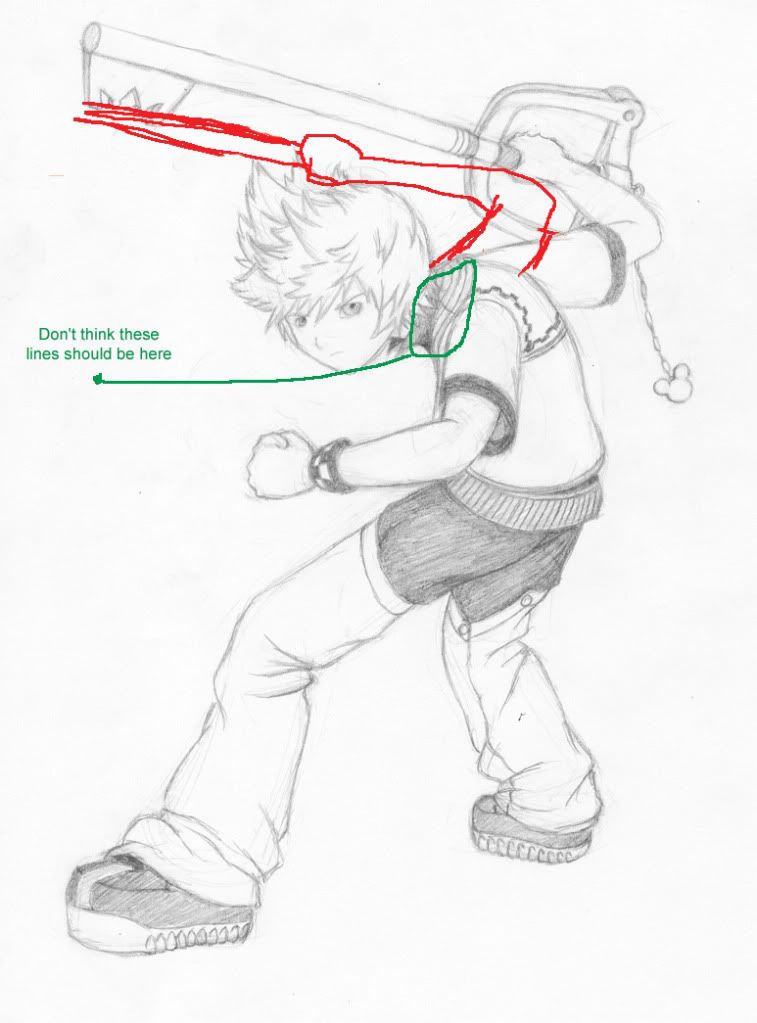
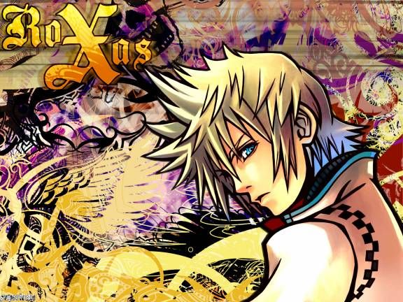
Finished another one of the owed drawings in the queue. This one is Roxas from Kingdom Hearts 2.  Also, added one to the queue to take part in an art trade with Tiffany. |
|
|
|
Post by Muramasa on Jul 10, 2009 20:22:12 GMT -8
Heh, it's Sara's favorite. It's funny because say what you will about Tetsuya Nomura stuff, Roxas is probably the least busiest of the design, I actually don't mind it very much. It looks like you hit all the major and minor details, which is nice, because that checkered design on his back must have been a bit of a pain to do. Heavy folds and creases are also annoying, in my opinion, so good work on that.I also really like a good, dynamic pose, specifically, the one that you choose for Roxas, because sometimes ones body posture and movement speaks more of a character than any clothing or accents one can put on a character. That being said, on to the critique. I really do like the general pose, but it looks a bit awkward and uncomfortable at certain points. Particularly, the right arm, back, and shoulder area. While it is a bit silly to do this, try actually doing that pose yourself. Feels painful doesn't it? I think that the right arm is a bit too far back, giving him a rather unnatural look. If you moved it a bit forward, I think that it would put it in a more natural position. As a nitpick, it looks like you have some rouge lines on his back. Those lines are supposed to be from the inside of his jacket, so they shouldn't appear on his back.   All in all, cool, I'm one of the many freaks that actually like beltan zippers. |
|
|
|
Post by Inaaca on Jul 10, 2009 20:37:37 GMT -8
Oh, sweet! A critique! Many thanks for taking the time to give one, man.
Yeah, the pose is a bit awkward. I started noticing this a bit too late in the drawing and just kind of accepted it. Thanks for pinning down exactly WHAT was awkward about it, though. I should get into the habit of actually doing a pose myself, particularly if I'm unsure about it. Glad you like the pose in general, though. I was kind of going back and forth on how he should be for a while.
As far as the lines on his collar, that's an oversight on my part. I thought that the collar was folded over all the way around. It wasn't until you pointed it out and I took a closer look that I noticed that this doesn't seem to be the case. Ah well, it's still kind of a minor detail, at least.
Thanks again for the critique. I really appreciate it.
|
|
|
|
Post by Muramasa on Jul 10, 2009 21:27:37 GMT -8
Oh, no problem, though I do find it odd that you're thanking me now. I tend to tell you what I think of your art often, though I'll admit, this was one was the first time I red-lined. Well, I'm willing to do it this way if it helps you out in any way.
|
|
|
|
Post by Inaaca on Jul 10, 2009 22:11:08 GMT -8
Dunno. Guess this one just caught me by surprise. :`
|
|
|
|
Post by Inaaca on Jul 11, 2009 19:37:36 GMT -8
Another coworker request knocked down. This is pretty much him being someone cooler than he actually is.  |
|
|
|
Post by Muramasa on Jul 11, 2009 19:41:40 GMT -8
You know, at the time, the picture wasn't fully loaded, but he sorta looked like Sloth from the Goonies at that moment.
|
|
|
|
Post by Inaaca on Jul 12, 2009 15:09:46 GMT -8
Knocked a couple more requests off the illustration queue. Results/explanations can be found in my most recent post in the Doodle thread.
|
|
|
|
Post by Inaaca on Jul 16, 2009 20:52:10 GMT -8
Completed Delia's request. I'm pretty pleased with this one. Also, this was a tricky pose, so I ended up using myself as a reference.  |
|